
Chat Templates
Each message has a type. The chat routes it to a renderer. Use the built-in templates for common cases — text, images, files, options, video — or plug in your own React component for richer message types.
Built-in Templates
Built-in Message Templates
Scroll through the chat to see text, image, multi-image carousel, file, YouTube, and quick-reply options templates. Click an option to fire the response.



// Different message types are routed via `type`. The built-in templates
// cover text, image, file, video, youtube, options, date, time, datetime,
// and a typing loader. Plug in your own with customMessageTypes.

const messages = [
    { id: '1', role: 'assistant', type: 'text', content: 'Hello!' },
    { id: '2', role: 'assistant', type: 'image', media: [{ url: '...' }] },
    { id: '3', role: 'assistant', type: 'options', content: 'Pick one:', media: {
        options: [{ title: 'A' }, { title: 'B' }],
    }},
    // …
];

<ChatWindow messages={messages} onSendMessage={handleSend} />
Custom Template
Custom Message Template
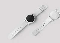
Plug in any React component as a renderer for a custom message type. Below, a `product` type renders as a fully custom card. Click 'Add' to fire a custom action.

function ProductCardTemplate({ message, onSendMessage }) {
    const data = message.media;
    return (
        <div className="product-card">
            <img src={data.image} alt={data.name} />
            <div>{data.name}</div>
            <button onClick={() => onSendMessage({ type: 'product-action', method: 'add-to-cart', payload: data })}>
                Add
            </button>
        </div>
    );
}
ProductCardTemplate.noContainer = true; // skip the standard bubble wrapper

<ChatWindow
    messages={messages}
    onSendMessage={handleSend}
    customMessageTypes={{ product: ProductCardTemplate }}
/>
Type Reference
// Built-in message types
type BuiltInType =
    | 'text'        // Default. `content` is a string with markdown-ish formatting.
    | 'image'       // `media` is an item or array of { url, name, description }.
    | 'file' | 'pdf' // `attachments` array.
    | 'video'       // `media: { url }`.
    | 'youtube'     // `media: { url }` (any YouTube URL).
    | 'options'     // `media: { flowId, options: [{ title, value, ... }] }`.
    | 'date'        // Date picker — emits selected date back via onSendMessage.
    | 'time'        // Time picker.
    | 'datetime'    // Date + time.
    | 'loader';     // Typing indicator (usually managed via typingUsers / showLoader).